Tutorial
Data Science Service Monitoring
SuperMap iManager supports to monitor Data Science Service environment. Users can understand the associations between the services and the status of services through topological diagram; grasp the overall status of the environment by monitoring the services; achieve service trace and service metrics by monitoring services flow.
The content below is going to introduce topological diagram monitoring, resources monitoring, and flow monitoring separately.
Topological Diagram
Please follow the steps to view the topological diagram:
- Clicks Sites Management > Your Data Science Service Site on the left navigation bar to enter the page.
-
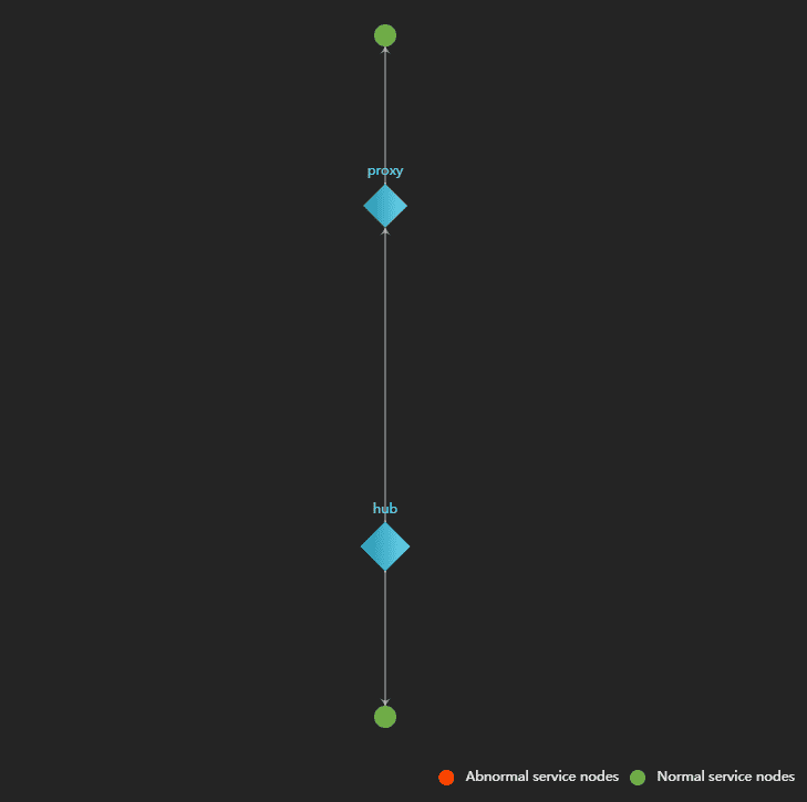
Clicks on Topo Diagram on the upper left side of the page, view the topological diagram of the Data Science Service environment.
The topological diagram of Data Science Service environment is helpful for understanding the association between the services. In the diagram, circle symbols represent service node(if the service extended, you can see a service has multiple circle nodes), the green circle means the service is running good, the red circle means the service is not working. The topological diagram supports to zoom in/out.
Resources Monitoring
SuperMap iManager builds in visualization and analytics software Grafana,supports to monitor the resources usage of services and containers, and check the real-time loads. The details introduction of resources monitoring please refer to GIS Cloud Suite Monitoring, the method of resources monitoring of Data Science Service is the same as GIS Cloud Suite.
Flow Monitoring
SuperMap iManager uses Istio platform to integrate microservices, manage traffic flow across microservices, enforce policies and aggregate telemetry data. The details introduction of flow monitoring please refer to GIS Cloud Suite Monitoring, the method of flow monitoring of Data Science Service is the same as GIS Cloud Suite.
